Microsoft is making all the right moves to regain the trust of PC users around the world with the launch of Windows 10 Technical Preview. The operating system in its current form is smooth with a few broken features here and there, but how does it stack up against the huge mess that is Windows […]
Microsoft is making all the right moves to regain the trust of PC users around the world with the launch of Windows 10 Technical Preview. The operating system in its current form is smooth with a few broken features here and there, but how does it stack up against the huge mess that is Windows 8.1? Let’s find out.
While both Windows 10 and Windows 8.1 are similar in many aspects, they are also very different. The change should be seen as analogous to the jump from Windows 7 to Windows 8, but this time around, it is all for the right reasons and users will find peace with the new operating system.
For those who are still on the fence, let is point out a few things you need to know about Windows 10 and how it compares to the soon to be dead, Windows 8.1.
The Start Menu and Start Screen:
The biggest problem with Windows 8 and 8.1 was the touch-centric Star Menu. It was a huge departure from what users were used to in previous Windows versions, which is one of the main reasons for the outcry. However, the good news is that Microsoft listened to the community and made some significant changes in Windows 10.
The company made sure to bring back the traditional Start Button along with the Star Menu. Folks should bear in mind that while the Star Menu has returned, it is now a blend of the traditional Windows 7 design, and that of Windows 8.1. Now, this is not a problem; it is actually an advancement of both, and it works really well.
On the matter of the Start Screen, it’s here too. Many might not realize it, but the Start Menu and the Start Screen are one and the same. What Microsoft did here was to add the option to expand the Start Menu into the Star Screen. Basically, those who preferred the Windows 8.1 way of doing things should feel right at home, and the same can be said for those who preferred the traditional style.
Better User Interface:
Not a big departure from Windows 8.1, but significant enough to warrant a mention.
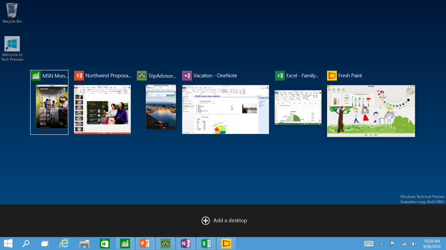
The modern Windows apps are here, but Microsoft made them easier to use. In Windows 10, the apps perform similarly to any desktop app instead of the full-screen mess that caused many users to rip their hairs out in frustration. Users can now run a desktop app alongside a modern app, and no one would be able to tell the difference.
Furthermore, the gestures that made little sense are gone. However, some things gestures that were good enough, such as swiping from the right to bring up the charms bar, is no longer here.
This time around, swiping from the right pulls up the Action Center, or notification center as it is called on other platforms.
Cortana and Bing Search:
Since Windows 8 and 8.1, Bing Search has been a central part of Microsoft’s vision on the desktop, and that hasn’t changed with Windows 10. What the software giant did here is to increase the search functionality with the addition of its new voice assistant, Cortana.
We have to say, Cortana is not a bad addition, but at the moment the use of this feature is limited. Cortana on Windows Phone 8.1 is much more functional though we expect Microsoft to bring parity to the desktop version in time for launch.
Still, we do not see ourselves talking to our PC anytime soon. It’s easier to do this with a smartphone, a PC, on the other hand, is entirely different.
Windows 10 should be available before the end of the year as a free download for Windows 8.1 and Windows 7 users.


Leave a Reply