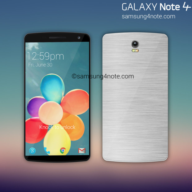
A new concept mockup of the Samsung Galaxy Note 4 features a series of aesthetic changes to the device’s outer-design language that are as impressive as they are necessary.
There’s been a steady stream of leaks and tip-offs on the subject of the Samsung Galaxy Note 4 as of late…some of which have been less exciting than others. The idea of the device sporting the same dimpled plastic back-plate as the Galaxy S5 and the same color choices is about as thrilling as a root canal, which is why we’re more inclined to side with the weird and wonderful concepts thrown out by the imaginative types.
After all, realism can be so overrated.
Taking everything we (think we) know about the Note 4 thus far, Rishi Ramesh has gone ahead and produced the mockup you see here. The first thing that stands out is the joyful fact that it doesn’t look like the Galaxy S5 and nor does it appear to be wrapped in plastic. Usually when we’re waiting for the launch of such a pivotal device it’s all about the hardware, but in Samsung’s case they’re so late to the metallic Smartphone party that little matters more this time around.
He’s clearly taken a few snippet of the standard design language for the Note series to date and sprinkled in a little LG G3 for good measure, but there’s no denying the slim-bezeled beauty is a looker.
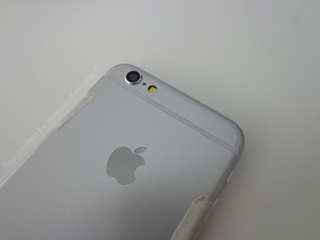
What’s perhaps most interesting about this year’s installment of the Galaxy Note is that for the first time in the history of history, it may well have to hold its own against Apple’s first ever Phablet. There’s talk of the 5.5-inch iPhone Air being held back to late Q4 or even Q1 next year, but in any case the Cupertio combatant represents a pretty pleasing alternative to the fourth-generation Note.
We’ll have to see how forcefully Samsung throws down the gauntlet…fingers crossed for the end of plastic jackets!
